10 Posters For Khruangbin
Sharing some thoughts, process and bad work habits.

When starting out as an illustrator, the thing I wanted to do more than anything was to make album art and work with musicians. I’ve always been deeply into music but I don’t play any instruments, so I thought of this as a way of being part of the magic. Maybe there’s something to that theory saying that if you want something strongly enough, it will happen? Because my path have crossed with so many wonderful musicians. My collaboration with Todd Terje has been a blast and milestone of my illustration career, and lately we’ve broadened our collaboration when he’s been composing music to my two shortfilms Liker stilen and Lumbago. I’ve also had the huge joy of working with my cousin and buddy, Daniel Herskedal, Emil Nikolaisen, Joe Keery (Djo), Coachella, Ivar Eidem, Dagens Ungdom and the Texas band Khruangbin.
Since I’ve designed ten posters for Khruangbin over nearly as many years, I felt like marking the occasion with a little retrospective reminiscence, and think out loud about the design process behind the posters. I’ll thank you for your patience in advance, both for my unpolished English and for my distracted mind, leading to digressional detours. As a carrot, I’ve gathered all the sketches at the bottom, so hang on to the end for some work in progress!
Before I continue I just want to say that talking about creative processes and what goes into real art and drawings feels more meaningful and important than ever in the dark age of AI. Especially after Open AI’s latest version of it’s tool of mass theft and soul massacre. Creating real art is a purely human process, it’s something we artists spend our whole life developing, struggling with and live for. It worries me to think of the coming generations who might not quite get what lies behind a drawing, painting, song, movie etc. and just think of it as a result of a prompt that anyone can achieve. (I wrote an article about his last year, read it here).
But right now, it’s Khruangbin time! Concert posters are usually meant to promote a gig in advance, but these posters are different. The band releases them at their shows as high-quality art prints in a limited edition, like a souvenir from the gig. I’m also selling a very limited number of these through my agent ByHands, so head over there if you’re interested (some are nearly sold out).

Not a clue what’s going on here, just a result of impro drawing.
The starting point for my collaboration with Khruangbin is this silly little flyer I made for a very special event back in 2016. Today, the band fills venues like the Sydney Opera House for several nights in a row, but on this little November evening, they played an intimate concert at Mono, a small rock bar in Oslo (unfortunately closed down a few years ago). Todd Terje had been recommended their album at a record shop in London and liked it enough that he invited them to play at the release party for Ola Kvernberg’s album The Mechanical Fair, which Terje released on his own Olsen label. Since I did all the artwork for Terje he asked me to do this little flyer as well. I don’t remember the idea behind this motive, but I like to improvise scenes like this. Revealing a little glimpse of something that could be a longer story, triggering people’s imagination so they might envision what happened before and what happens next.
I was looking very much forward to this enchanted evening, but then I suddenly remembered — damn it, I’m supposed to DJ at Hells Kitchen with Espen that night! Under the name KNA Hjulspinn, we played hard to digest taffel music for those eating pizza early in the evening, before the place emptied and you could expect tumbleweeds rolling by. It suited us fine since we didn’t have the confidence to keep a dance floor going anyway, and we enjoyed just playing records for each other. Luckily, Khruangbin played so early that we managed to catch a portion of their magical little concert before hauling our records up the hill to Hells. After serving some musical pizza topping we rushed back down to Mono and caught Terje and DølleJølle ending the evening with Seabirds (Alessi Brothers).
“When I’m starting on a new drawing, the first thing that comes to mind is to draw someone drawing.”
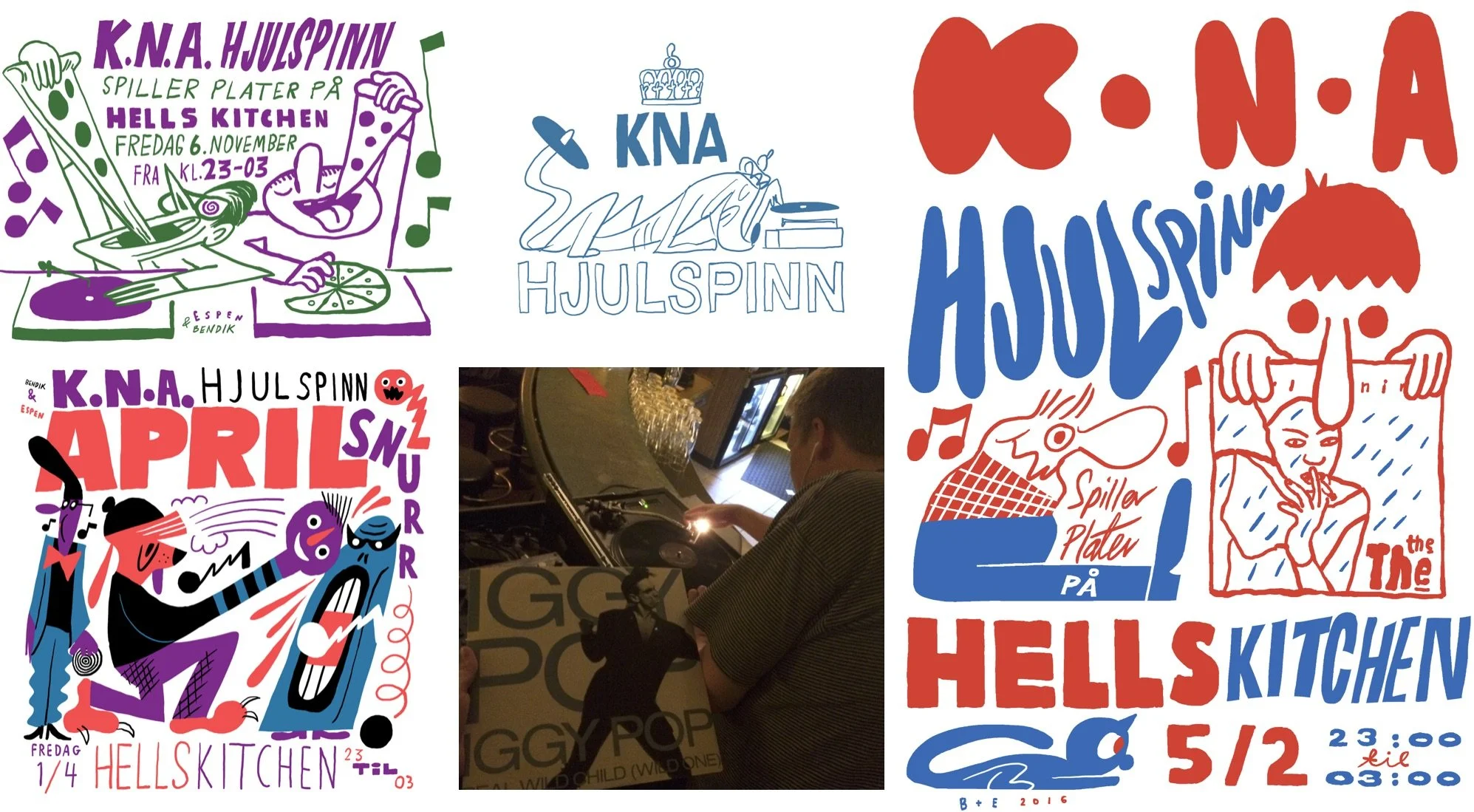
We made a bunch of flyers for our evenings at Hells, but pretty much no one came. Maybe people got turned off by DJ’s with Apple earplugs, he he.
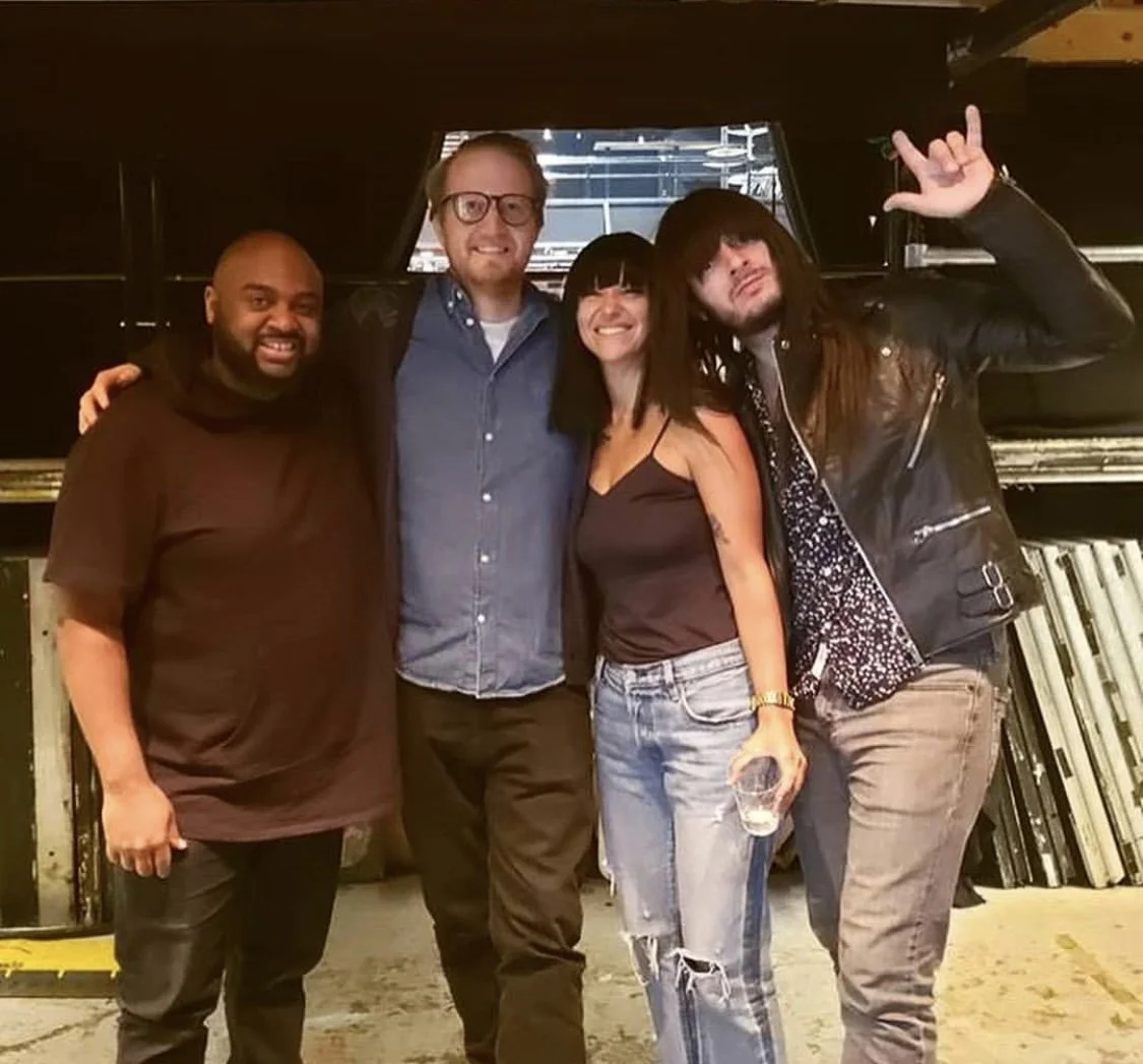
After the event, Terje told me that Laura from Khruangbin liked the flyer and wanted it as a print on her wall. A few years later she reached out. I was having breakfast at a sidewalk café in LA when an email from Laura pinged on my phone. As I read the email, I heard a honk and a loud crash, followed by an insane scraping noise. I looked up to see a tilted motorcycle sliding sideways at high speed right past me on the road, sparks flying. Behind the bike came the rider, sliding on his stomach like a seal, thankfully all dressed in full biking suit and helmet. Before I could react, the guy jumped up and shouted through his visor that he was “All good, no worries!”. It seemed like absurd and intense episodes were a natural part of the LA experience. I actually felt quite at home in the madness, maybe because it felt like being inside my own comics. Anyway, this email from Laura was the beginning of our collaboration. She wrote that she wanted me to create a poster for their upcoming European tour, as well as an exclusive poster for a concert at Brooklyn Steel.
Khruangbin has from early on obviously had a great understanding of illustration and the medium’s powerful potential. They’ve had a spectacular line of illustrated posters made for their gigs, and instead of sticking to one artist, they’ve worked with a whole bunch of different illustrators. When I started working with Terje it felt like I (more or less unintentionally) developed a specific style that became the visual identity of Todd Terje, but it’s fascinating to see that Khrunangbin has used loads of different illustrators with vastly different styles and still achieved a pretty clear visual identity. And it’s not due to a strict brief either, because I’ve always felt very free and almost been a little surprised when some of the more trippy and silly sketches I’ve sent them have been approved.
OK, so let’s have a look at the posters! First, we have THE THIRD ROOM TOUR

When I’m starting on a new drawing, the first thing that comes to mind is to draw someone sitting and drawing. Maybe it’s laziness, as if the screen becomes some sort of mirror. Or I just can’t be bothered to come up with any other ideas than what I’m doing at the moment. Usually, I manage to resist and draw something else, but sometimes I give in. The band’s drummer, DJ, got the honor of being the one drawing here. Btw, this is probably the only of these posters that was actually used as a poster, for promotion ahead of the tour and not only as a souvenir at the concert.
“I have to feel my way until I sense that it’s right, that the composition works. I feel it in my gut, not in my head.”
Despite having drawn countless posters over countless years with lots of text and info, I never learn to leave enough space for the text! It has never happened! I always start out with big movements and naive, eager enthusiasm. When drawing a composition that, after some wrestling, finally sits right – it hits me … “Oh heck, I forgot about the text. Well, I’ll just squeeze it in… no, damn it, there’s no room … well … maybe I’ll have to shrink the drawing a bit … but I want that figure to fill up as much space as possible, I want it to pop … damn it!!”. This idiotic inner monologue happens every single time I make posters. The solution is always the same: I have to shrink whatever motive I’ve drawn to make room for the text. And every time, it feels like pouring cold water on a lively fire. But after some tweaking and cursing, I can usually (not always) feel that the interaction between the drawing and the letters restores the tension I felt was lost when the drawing was shrunk. It’s a meticulous process guided by gut feeling. I have to feel my way until I sense that it’s right, that the composition works. I feel it in my gut, not in my head.

I managed to mess up my cousin’s name on TWO ALBUMS!
And while we’re on the subject of consistent and weird mistakes: I love to work with hand-lettering on posters and album covers, but I always spell something wrong. It’s as if I’m not writing the words but drawing them, and loose sight of what they actually say. The letters are reduced to shapes, and I get more hung up on whether it looks harmonious as a composition or not. Usually, the client catches the mistakes before it goes to print, but a few slips away. I’ve managed to spell the name of my own, dear cousin Daniel Herskedal wrong on two(!) of his albums (sorry, Daniel)! On both occasions I discovered the mistake when I held the physical album in my hand. Not a great feeling. And on almost every Khruangbin poster, I’ve written the wrong year or made other mistakes! Thankfully, this was quickly spotted by their skilled (and patient) team before it went to the printers.
BROOKLYN STEEL
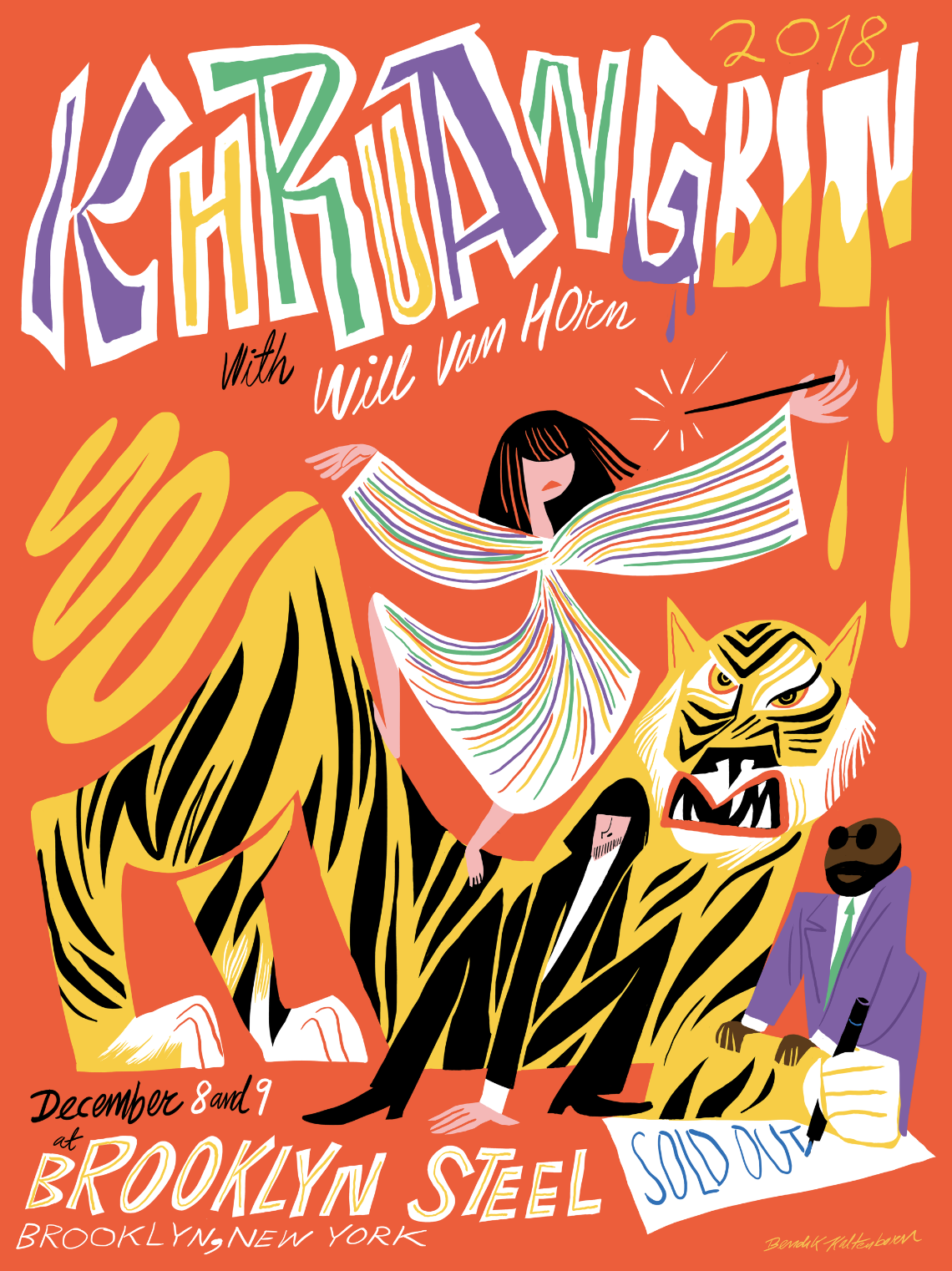
“I prefer to draw without looking at visual references, just drawing what I see in my mind instead of what I can see in front of me.”
There’s a big difference in which words feels good to draw and which don’t. Some words have letters in them that just don’t get along with their neighbors and make the word look horrible no matter what. Some letters shouldn’t be allowed to stand next to each other, at least from a visually point of view. But there are words built from a perfect selection of letters. They form a happy family, or a party, making the word look great every time you draw it. Khruangbin (which means “airplane” in Thai) is one such word. It’s a joy to draw it every single time. The way the letters meet and stand side by side just adds up visually, it feels like Tetris in a way.
The motive …. there was no brief, as I recall it, so I just improvised like I usually do. I did one other version at first with fewer colors, that you can see in the sketches section at the bottom of this article.
CHICAGO
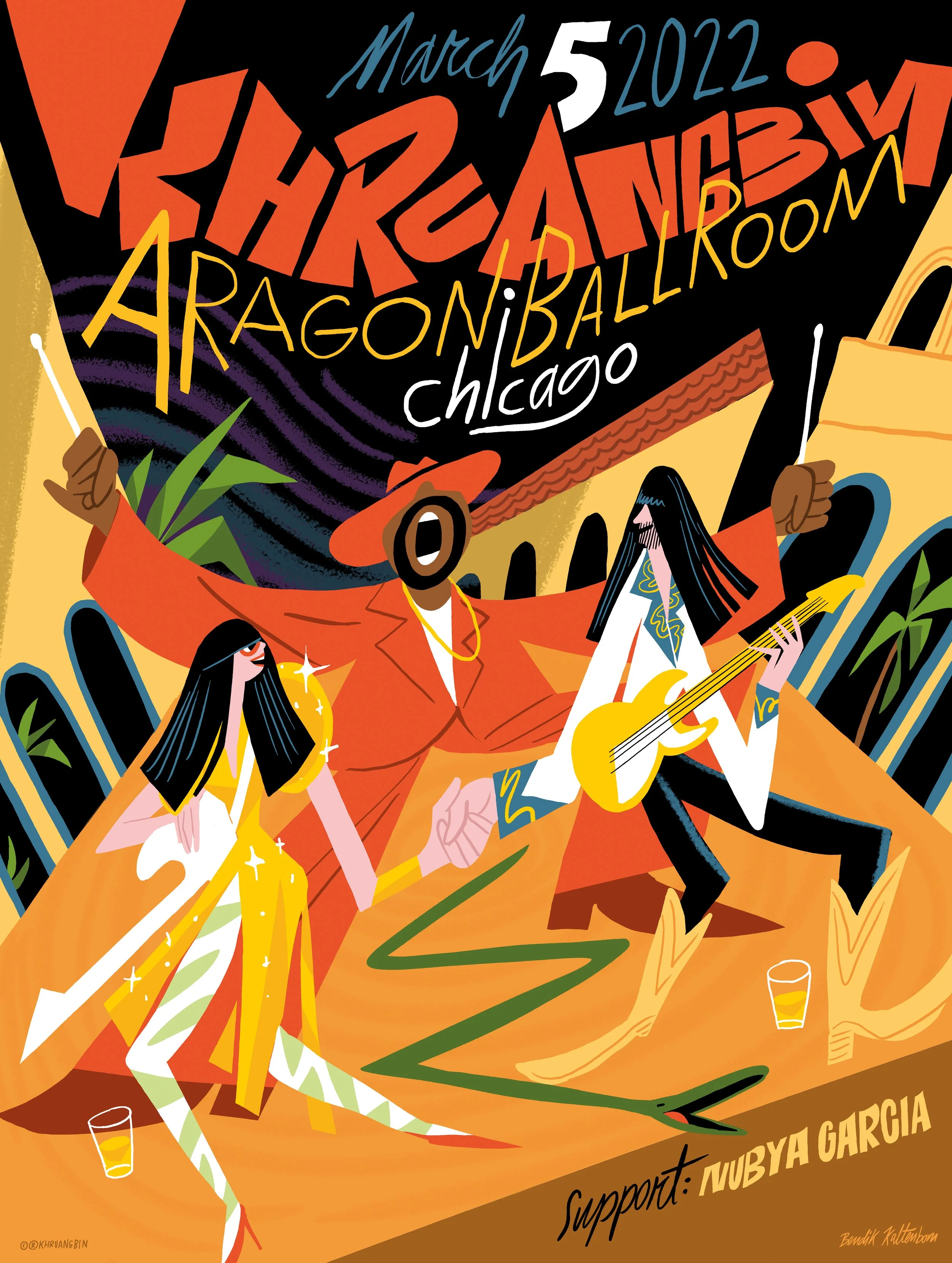
I prefer to draw without looking at visual references, just drawing what I see in my mind instead of what I can see in front of me. But obviously there are several exceptions. Like this one, with a spectacular venue that the band wanted to be included in the poster. I did a lot of research on the interior and loved it, but in the end it turned out quite stripped down. I broke up the scenography and distorted the perspective to be able to include the elements I wanted.
When working with visual references, I usually find photos online and drag them into my Photoshop or Procreate document. Then I arrange them together, merge the layers and scale it down so I have all the visual references in a small collage, in a layer I can turn on and off and look at whenever I need to.
The handshake Laura and Mark is doing here comes from a ritual Laura told me about. It’s based on the drink «Chicago Handshake», which apparently involves a shot of Malört chased with a small can of plain beer, followed by a handshake, which they do when playing in Chicago. Like in so many of my drawings, this one involves a snake. I guess they’re just fun to draw, like they’re living lines.
STOCKHOLM
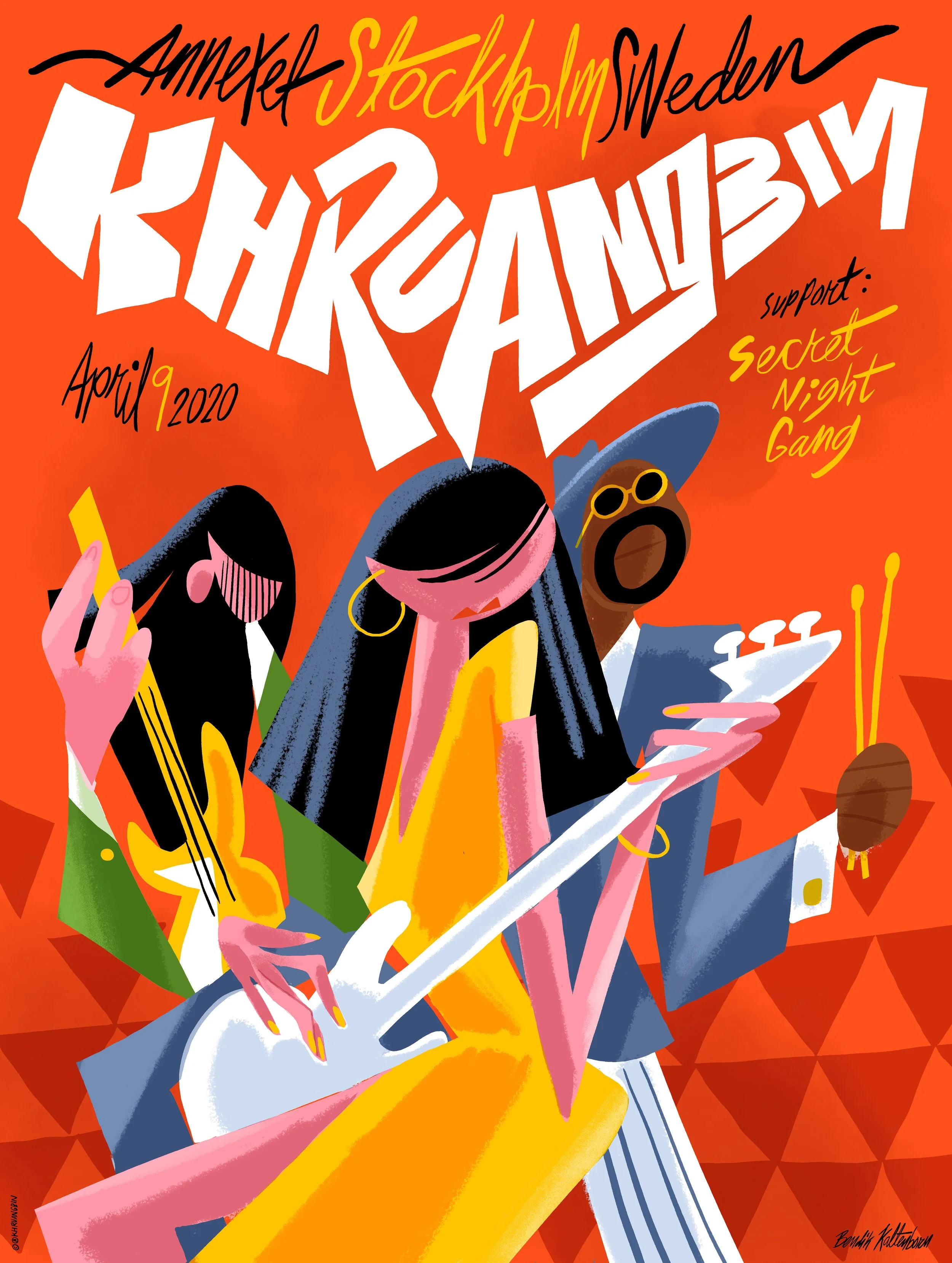
I lived in Stockholm for two years when I did my master’s degree at Konstfack almost twenty years ago and wanted to include something Stockholmers would immediately recognize. I chose the iconic “Plattan” pattern from Sergels torg, which forms the background of the poster. I felt like trying out a more rough and abstract style on this one, but whenever I try to go abstract It’s like I get pulled in by a more figurative force, weather I want to or not. The shapes just very quickly starts to become characters or recognizable forms. It’s a bit annoying, like I don’t have the guts to trust a composition with undefined forms. Yeah, so I guess this was as abstract and rough as I could manage.
AMSTERDAM
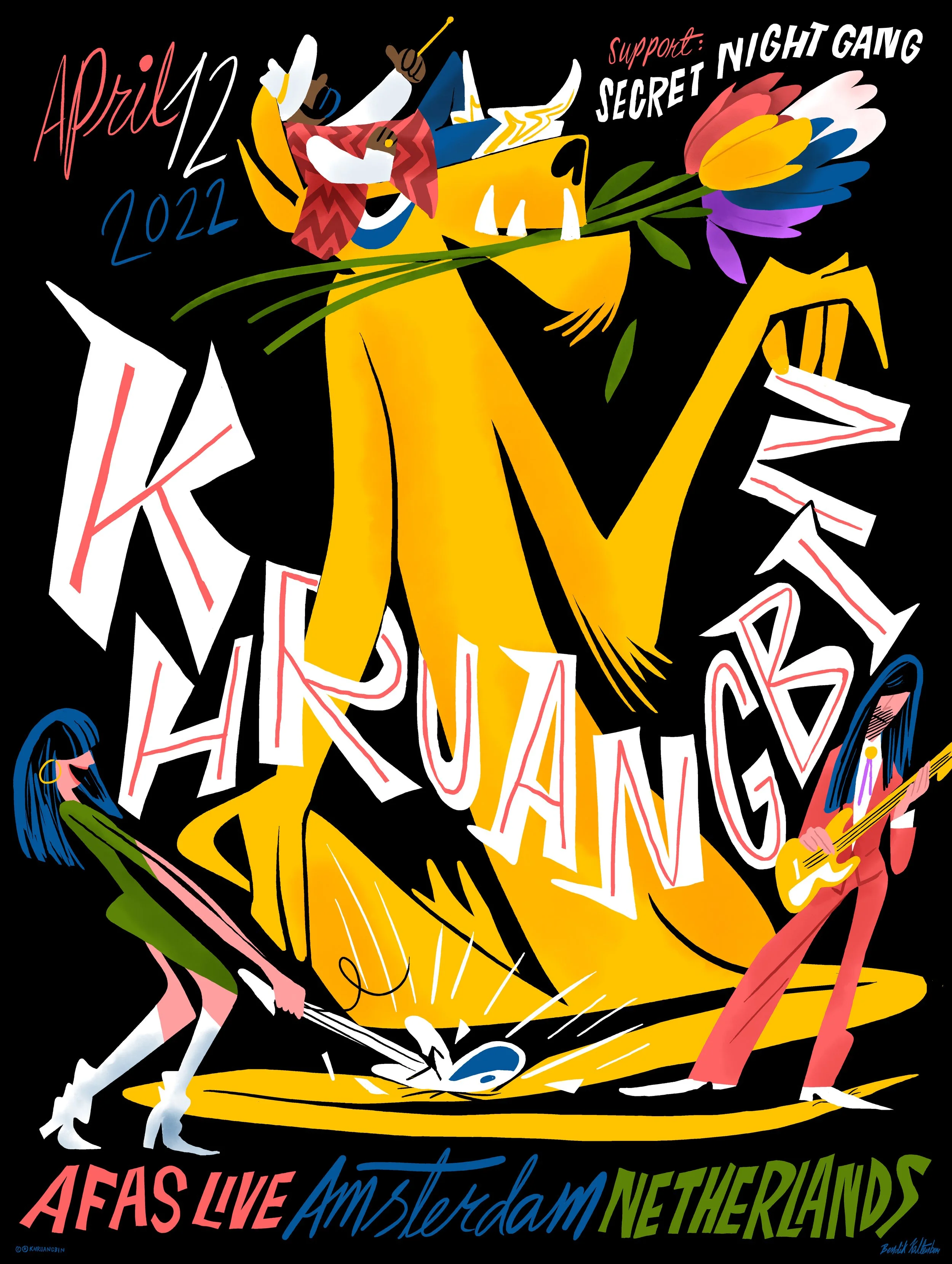
I was so hyper focused on the lion here that once again, I forgot to leave space for the text — there wasn’t even room for “Khruangbin”. I absolutely didn’t want to shrink the lion; it needed the whole format to thrive and be free. But sometimes stubbornness pays off. After much fiddling and swearing, trying to squeeze the text into the few gaps, I realized it was possible to place the text right across the lion without ruining it!
The “retro lines” in the Khruangbin title – I’m very inspired by old posters from the mid previous century, but I’m trying to be cautious. It can so easily tip over into pure nostalgia and end up as just a style study, which I’m not interested in. Again, it’s gut feeling that tells me whether it lands on the right side and feels enough like my style, rather than just becoming a pastiche of old posters.
“I’m very inspired by old posters from the mid previous century, but I’m trying to be cautious.”
SYDNEY
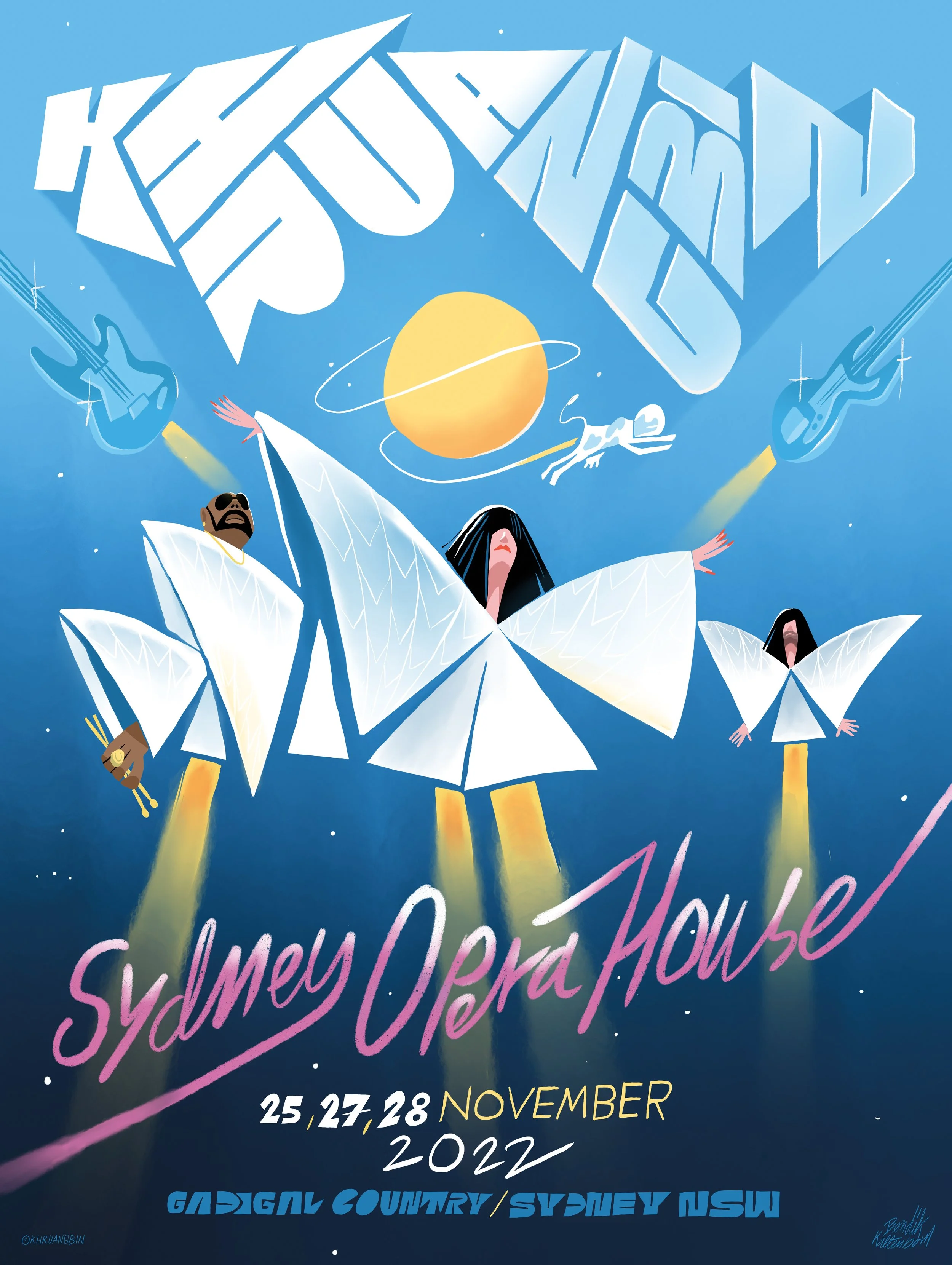
Slightly inspired by the poster for Terry Gilliam’s excellent movie “Brazil”.
Sometimes I just get an idea that I can’t let go of, no matter how stupid it is and how much I wrestle with it. It feels like it’s not meant to work, but I just can’t stop trying. This time, I got it into my head that I absolutely had to turn the Sydney Opera House into some sort of spacesuits for the band. After many hours of struggling I had spent so much time on something that just didn’t come together that… instead of trying something else, I insisted on forcing it through. And all of a sudden it just worked! The stubbornness doesn’t always pay off, though. Sometimes this donkey method just results in a lot of wasted time before I eventually surrender and go back to square one, after spending way too much time on it. That’s when I try to find comfort in the words of my professor and tutor at art school, Andreas Berg: “It’s not wasted time and effort to do stuff you end up not using, because you’re always learning from it».
It’s so strange, because often I sort of see or feel these ideas and compositions in my mind before starting out, but when trying to draw it I realize that the ideas are pretty foggy and I actually don’t see them very clearly at all, and they can just vanish like a dream when you wake up in the morning. Poff!
MELBOURNE

This one was created at the same time as the Sydney poster, but it was an unannounced intimate bonus concert and they wanted a simple black-and-white flyer that could be made on a copier. It was fun to work on two so different styles simultaneously.
NEW ORLEANS
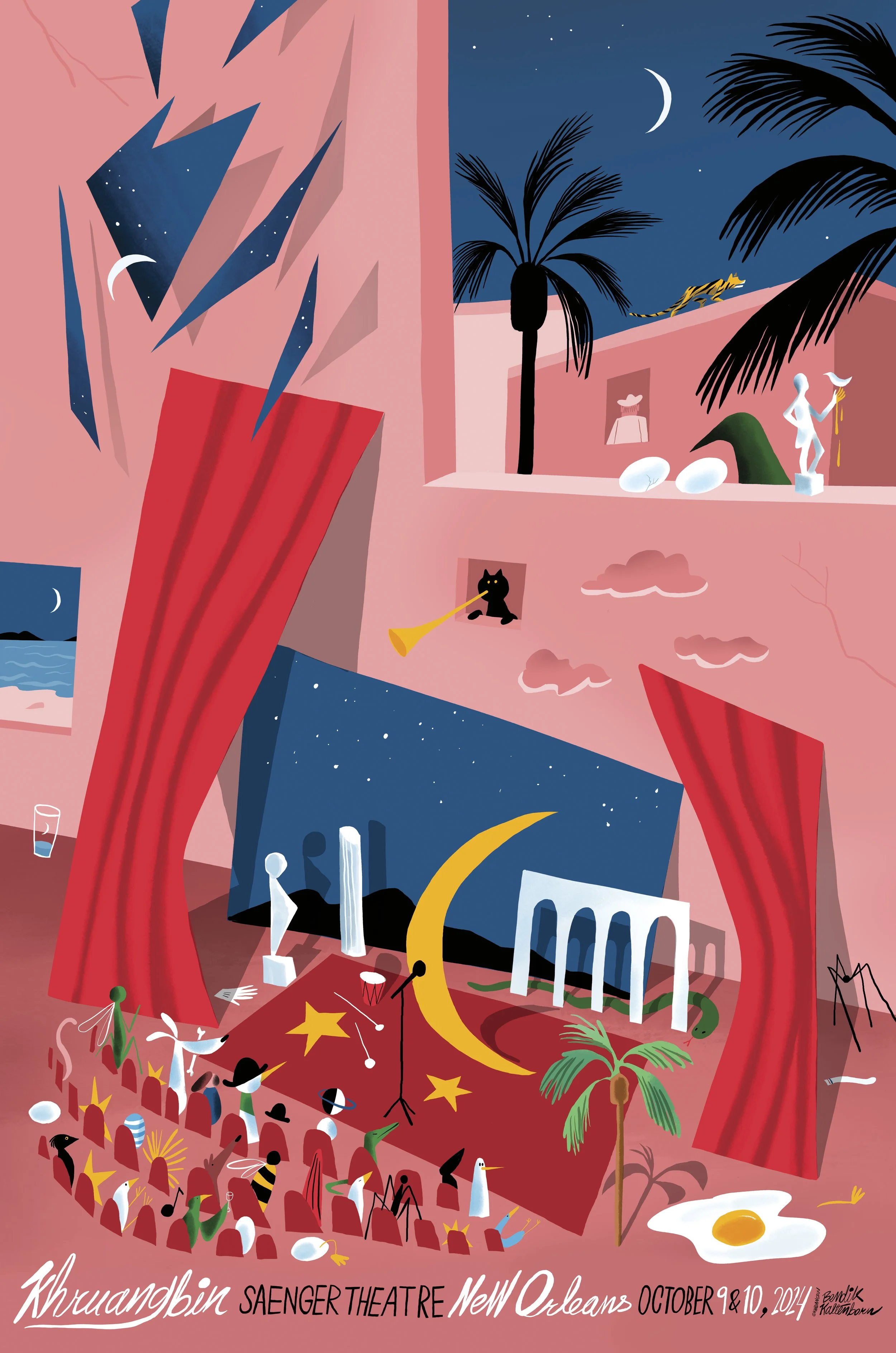
On this tour, the band had some guidelines to tie the posters to their latest album, A La Sala. The illustrators were free to draw whatever they wanted, but the motif had to include a window frame in the upper right corner, like on the cover art of A La Sala. The text should be placed at the bottom of the posters in a single line. The brief also encouraged to include some hints to surrealist painter René Magritte.
PARIS
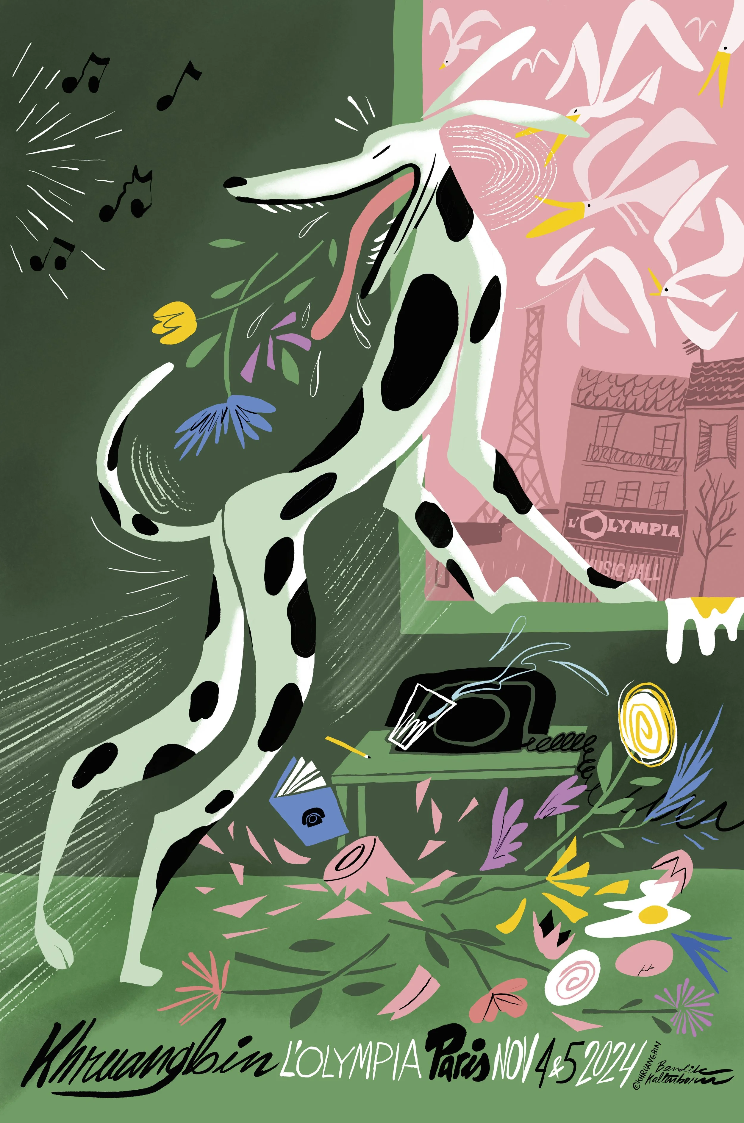
This was the same tour as New Orelans, with the same guidelines. I imagined the scene taking place in an apartment opposite the concert venue, L’Olimpia. Daytime, the people living there maybe at work, the dog home alone. It’s attention torn between a flock of seagulls outside the window and music playing from an unknown source. In it’s conflicting eagerness, it knocks over a vase of flowers. Not a fantastic idea or genius concept, but I often like to let a vague feeling or mood dictate the direction and see where it takes me. Sometimes it turns into a wild goose chase, but often it goes all the way. And it’s just my preferred method, although not very efficient and pretty unreliable.
Fun fact: I drew this poster while being on Joachim Trier’s film set. In his upcoming movie, Sentimental Value, there’s a scene taking place in a bar where I often sit and draw in my sketchbook, and I was invited to be an extra in the background of this scene. In between takes I would keep working on the poster on my iPad, but whenever the camera was rolling I would draw in my little sketchbook. Knowing the importance of extras, I was afraid to ruin the shot by looking off in any way, so I just focused on drawing and hoped I would look natural. For some reason I just kept drawing the same comic page over and over, probably because I didn’t have to think and could just go on auto pilot. As always with film, I might of course end on the edit room floor, but it was a fun day.
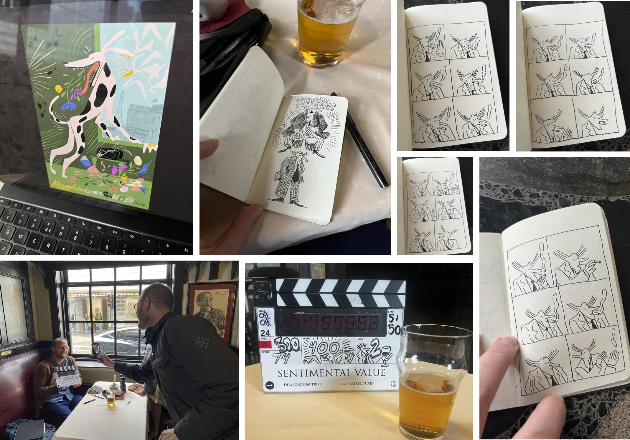
I just kept drawing this character Bongo-Hans over and over again. He’s appearing in my latest comic book Sykt Nais, and I’ve been exploring him in a screenplay I’m working on. I was also invited to decorate the slate number 400.
SKETCHES
Finally, let’s get into the mess of the process. Many of the sketches was never shown to the band. I usually send sketches that are not too far from a possible final. Maybe I’m underestimating people’s fantasy and ability to picture the potential of a rough sketch in their mind, I don’t know. But I feel like I have to reach a point where I can see my vision very clearly in the sketch before I show it. But it doesn’t necessarily mean I’m spending ages on a sketch, because the way I work the motive can appear quite fast. Other times not. That’s the thing with this line of work, you never have a clue how long a job will take you, because you never know if you’ll nail it right away or spin in a ditch for ages. The seemingly easiest job can turn out to be a long and frustrating stroll in the fog.
The moment I attach a screenshot of a sketch in an e-mail to send to the client, that’s when I know if I truly feel ready to send it or not. I take one last, very critical look at the thumbnail. After imaging the recipient looking at the sketch, I usually go back to the drawing table. Sometimes just doing minor adjustments, but not seldom do I start all over with something new. A few times I manage to just send it like it is.

I liked this one, but I still had the other idea in my mind and scrapped it before sending it because I knew I wouldn’t be able to get that silly sci-fi idea out of my head.

Left: at this point I felt I nailed the idea with the Sydney Opera House as jet space suits. I guess this was the first sketch I sent them. Right: I liked the look on this one, but the whole idea or whatever was just a bit unclear and I probably never sent it to the band.

This was initially supposed to be a screen print, so my first sketch was scarcely colored.

I wanted Mark to somehow merge into the tiger’s stripes. I don’t feel that I succeed 100% with that part in the end. Again, the Khruangbin letters are such a joy to draw.


I liked this initial abstract approach, but I didn’t manage to land it properly so I ended up in a bit more figurative direction.

A bit too hyper DJ banging the lion’s head in the first version here, he he.

Right: I have a bad habit of reading briefs quite sloppy and missed the part where it said all text was supposed to be at the bottom, so I had a little struggle placing both all the text and the most crowded part down in the bottom here.
Thanks for reading!